Tenba
Tenba provides high-quality, innovative camera bags, backpacks, messenger bags, transport cases, and tools to ensure the safety of photography, videography, and computer equipment in all weather, travel, and wear.
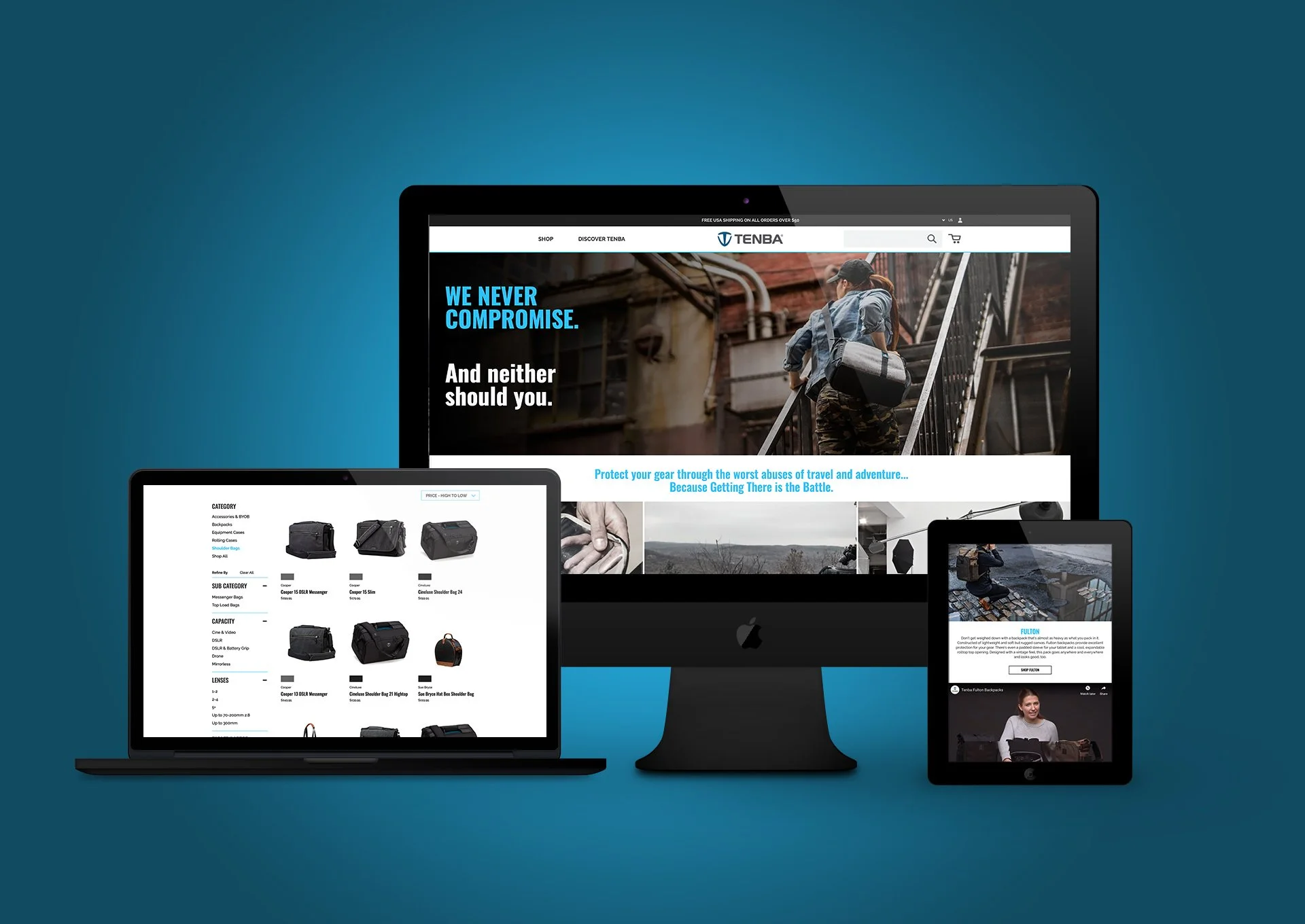
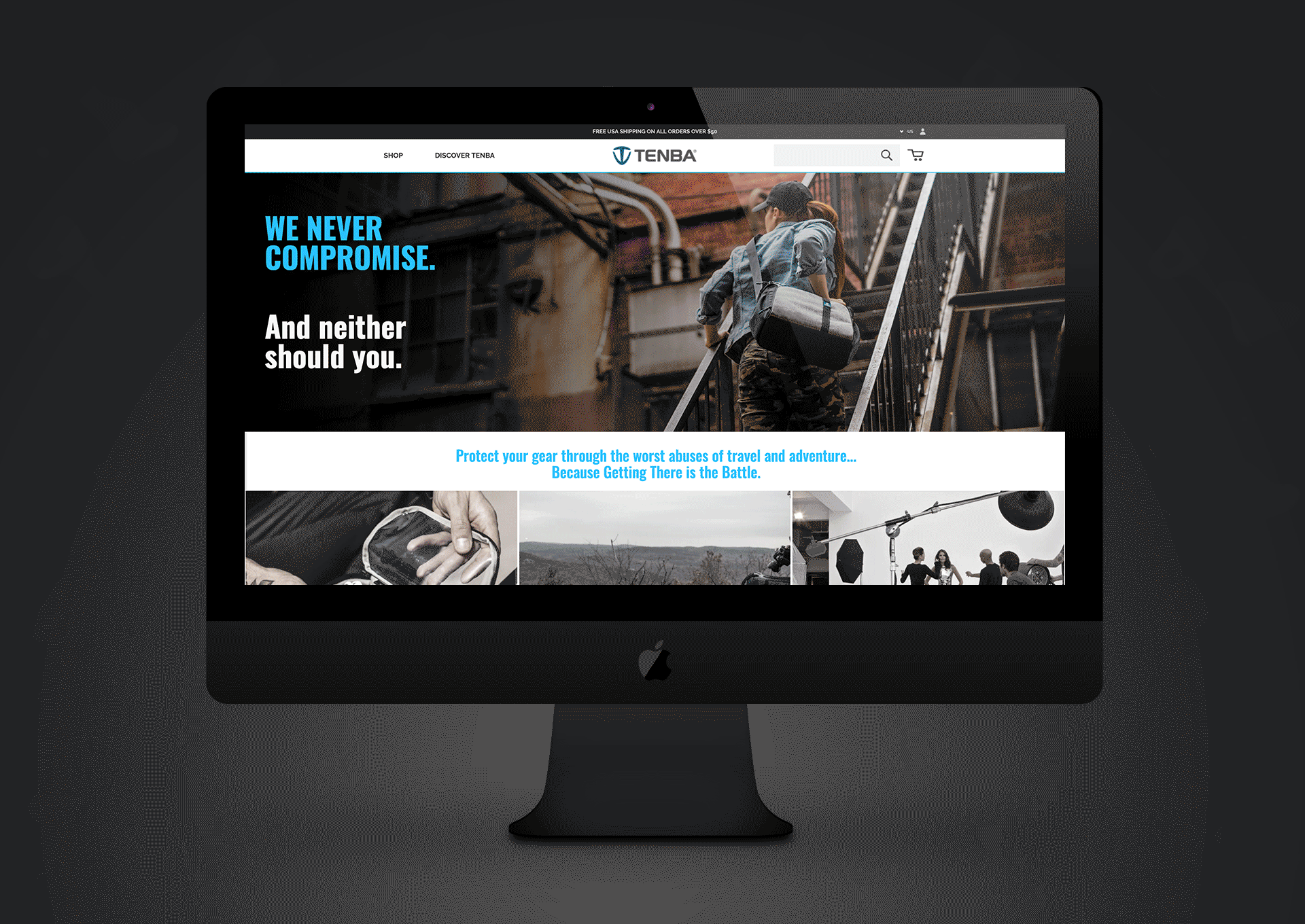
Project: Tenba was looking to replace a dated website built on an aging CMS with a more modern site with improved navigation and a larger emphasis on quality photography.
My Role: User Experience and Design Direction. As the design director, I headed up the UX and visual design portion of the project, leading our agency partners in creating the initial sitemap and wireframes, creating high-fidelity mockups, researching competitors, and collecting insights from Tenba's stakeholders.
User Experience Goals
Provide clear user journeys for three main customer types (outlined below in the Journey Map)
Reduce confusion surrounding the multiple product collections by providing clearer information and usage scenarios
Provide a pathway between product education and the shopping experience, enabling users to easily move from one to the other
Technical Goals
Reduce bounce rate
Improve time spent on page
Competitive Research
I separated Tenba’s competitors into two categories: Financial competitors and Design competitors. I wanted to make sure there was a distinction between companies that Tenba wanted to compete with tonally and aesthetically, and ones who were competing in sales by either offering a better user experience or through marketing activities.
Findings
Tenba’s aesthetic competitors were leaning heavily into adventure/wanderlust style imagery. To differentiate themselves, and lean on their “born in New York” heritage the recommendation was made to utilize an urban aesthetic. Product and lifestyle imagery was to be taken in and around NYC to showcase the brand’s toughness and versatility.
Evaluation of Current Website
I spent time having a few users go through the current site, mapping out some pain points, and working with the analytics team to find trends and areas where users might be dropping off or getting confused.
Tenba’s current website used a very small max-width for the main content area, which did a disservice to product imagery and overall navigation on larger monitors, leaving the impression that it was out-of-date.

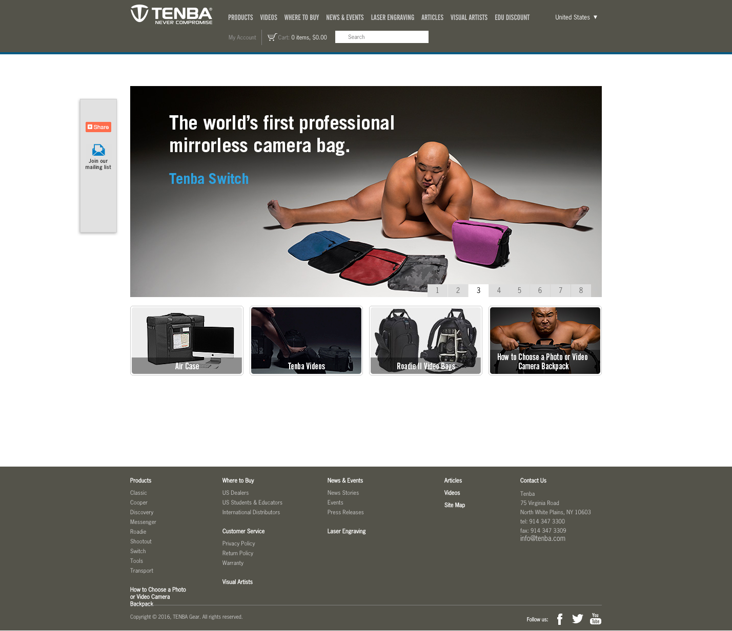
Key findings
Analytics showed that users were confused by the many ways to navigate the site, switching back and forth between collections to figure out what they were looking at.
On the shopping page, product filters were confusing and/or irrelevant. Important filters, such as indicating whether or not a bag was carry-on compatible, were missing.
User reviews were misleading since a product with 0 reviews would default to 5 stars. Additionally, very few reviews overall harmed perception.
Personas
I built out three personas that captured the feedback we’d collected from speaking with users at tradeshows, discussions with the brand and sales team, and the demographic information provided by the analytics.


Journey Map and Wireframe
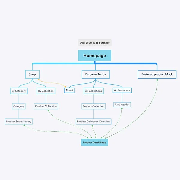
A journey map was created to outline all the possible pathways to purchase without dead-ending at any point.
The user personas were then run through these pathways to make sure various use cases were being addressed:
Power shopper: Needed a straightforward path from shopping to product to purchase.
Recreational shopper: Needed a pathway to explore the various collections and their features and benefits.
Reluctant shopper: Needed a pathway that provided brand education and awareness.
Wireframes
Wireframes were created externally by an agency partner. I was involved in defining the goals and flow of the pages as well as collecting feedback from the brand and making sure it was implemented.
Wireframes provided by Shore Digital.
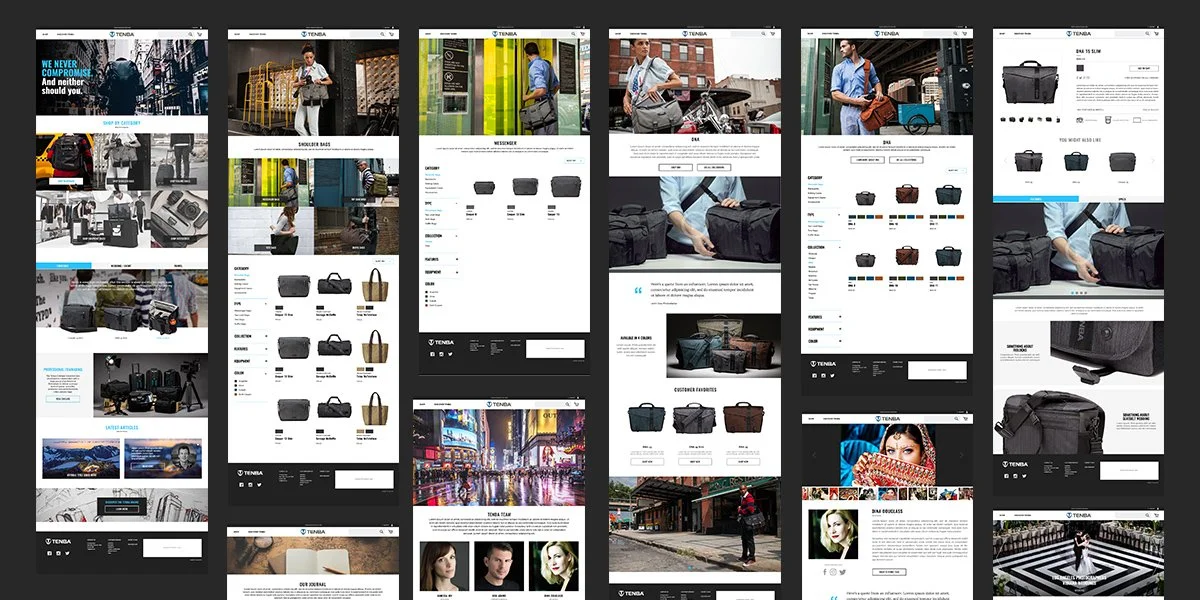
High-fidelity mockups
Once the flows and wireframes were approved, I created high-fidelity mockups so the brand team could get a feeling of the aesthetics for the site.
Development
Once the high-fidelity mockups were approved, I worked with our agency partner on development by annotating the mockups and outlining interactions with the development team.
User Testing
Once development was nearing completion I ran eight user testing sessions where I brought in people with varying degrees of familiarity with the Tenba brand and observed them using the website.
Key observations
Generally favorable reactions to the emphasis and use of photography
Large, full-screen hero images were sometimes overwhelming. The decision was made to reduce their max height so content was visible in the lower third of the screen.
Filter functionality was confusing. It wasn’t immediately clear if filters were inclusive or exclusive, single-select or multi-select. I ran a separate testing session to identify pain points and recommend solutions to development. These were implemented and re-tested before launch, with an overall improvement.

Launch
Upon launch, the site was well-received by photo dealers, representatives, and customers. The revised visuals and focus on photography were pointed-out as a major improvement.
You can view the live site here: Tenba
Results
In the 8 months since launch, the site's bounce-rate has decreased by 14.77%, while the session duration has increased by 11%. Direct e-commerce sales only accounts for a small portion of Tenba’s overall sales, however, since the launch web sales have also seen an increase of 6%.